This project is for UX study purposes, is associated with Purwadhika School, and is not affiliated with Zalora Indonesia or any of its products.
Zalora Indonesia - Crafting the App for Seller to Register and Launch a Product

Bootcamp Project • 2021

I completed this case study as my final project during the Purwadhika bootcamp. My lecturer challenged us to solve a problem on Zalora's B2B platform for sellers. I worked on the research part with three other designers before designing my own solutions. Throughout the project, I followed an end-to-end process that involved conducting research, generating ideas, designing, testing, and iterating to create a mobile app solution.
Timeline
2 months (December 2020 - February 2021)
My Roles and Responsibilities
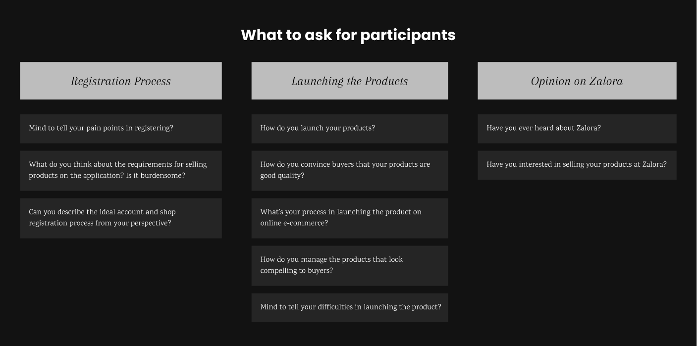
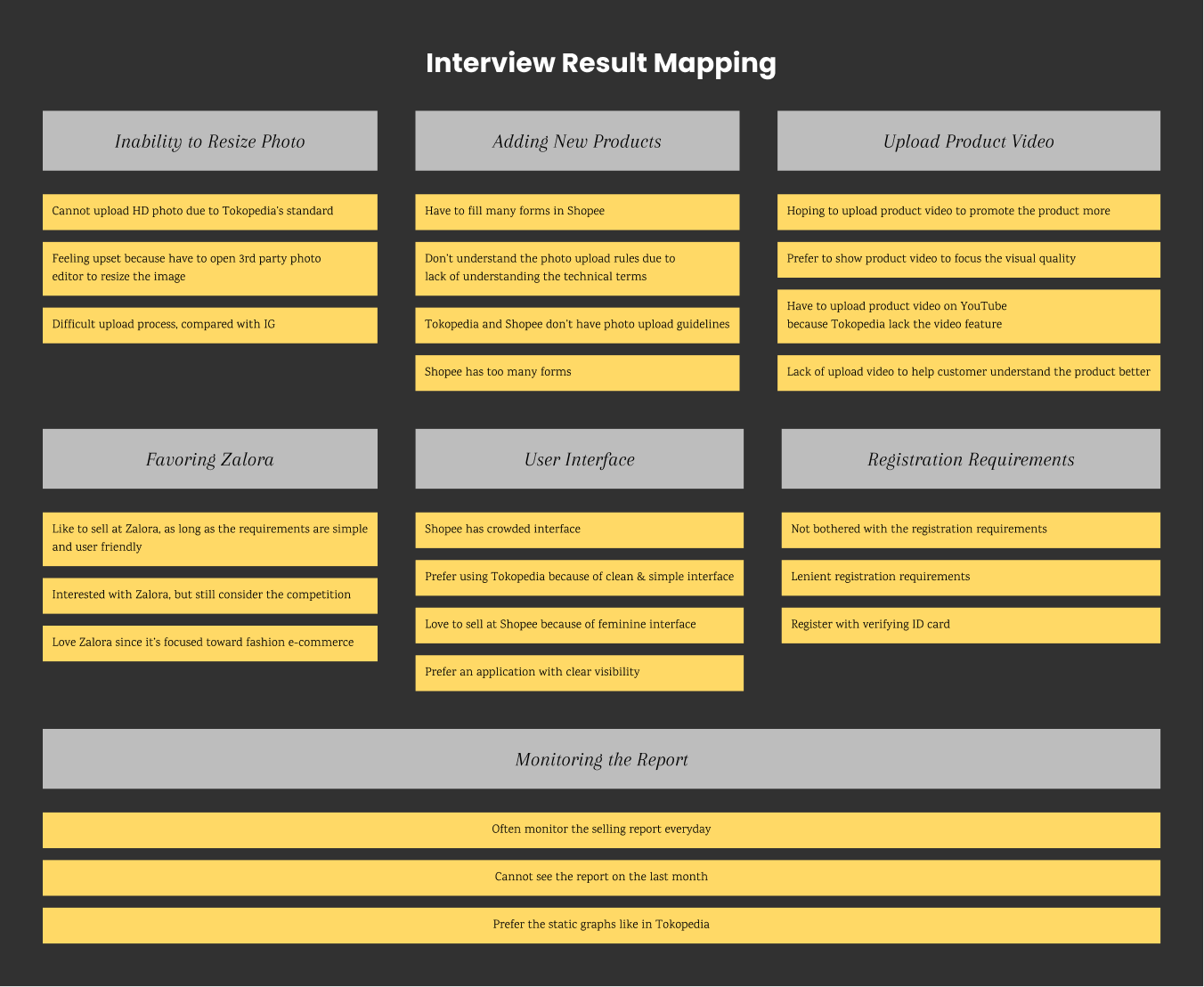
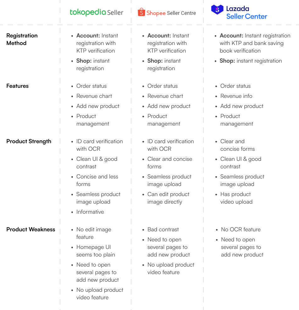
  • Conducting user research to understand the frustrations of launching new products and registering store and accounts on similar e-commerce platforms.
  • Collaborating with my team to brainstorm possible solutions.
  • Designing the user interface and creating prototypes.
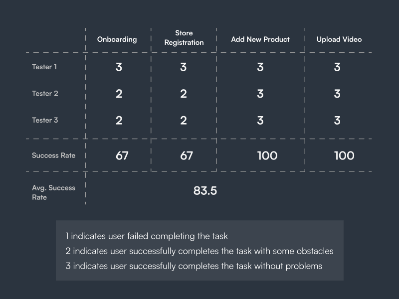
  • Testing the prototypes to evaluate the user experience and gather feedback.
  • Incorporating feedback and iterating on the design based on the test results.
Challenges
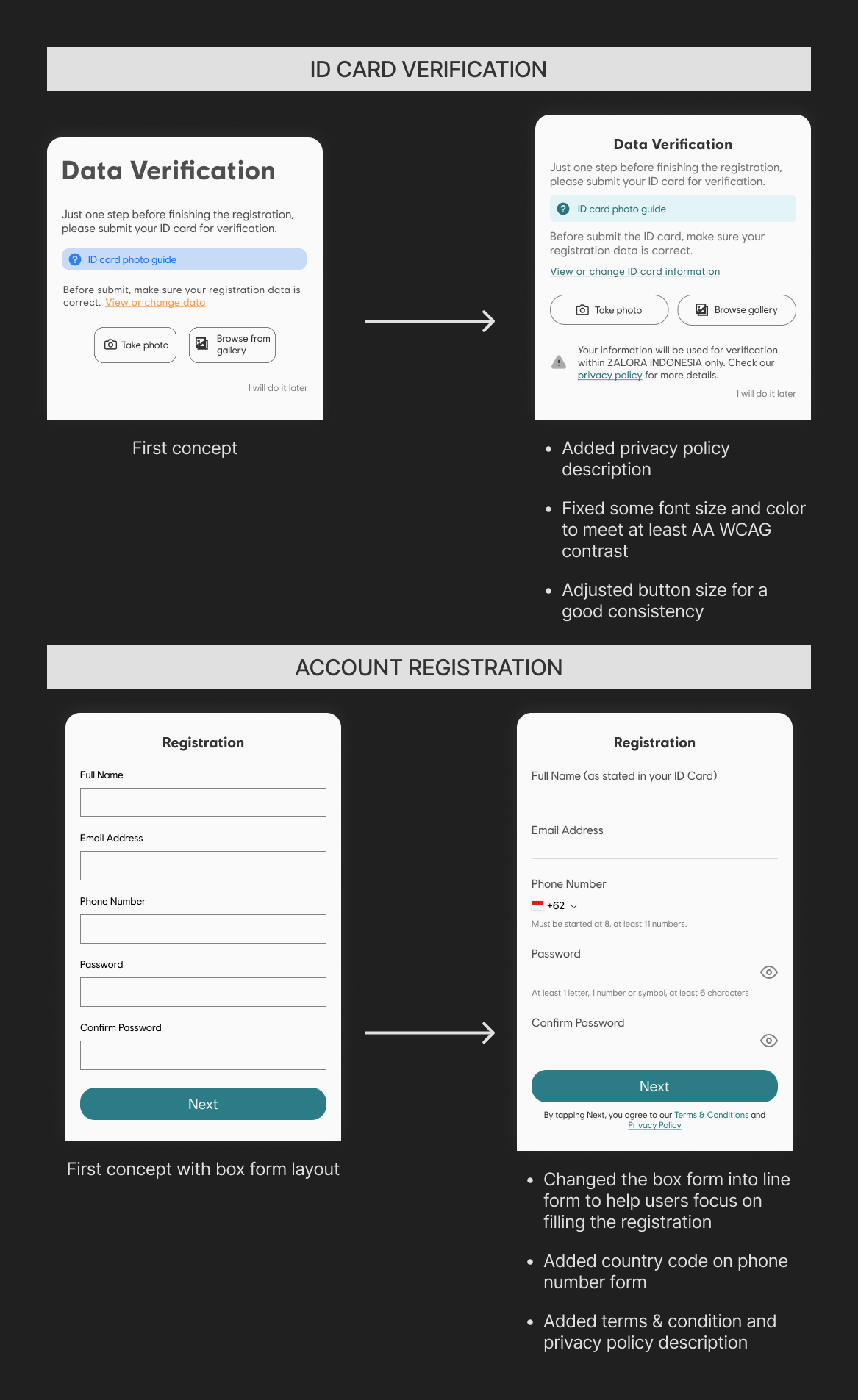
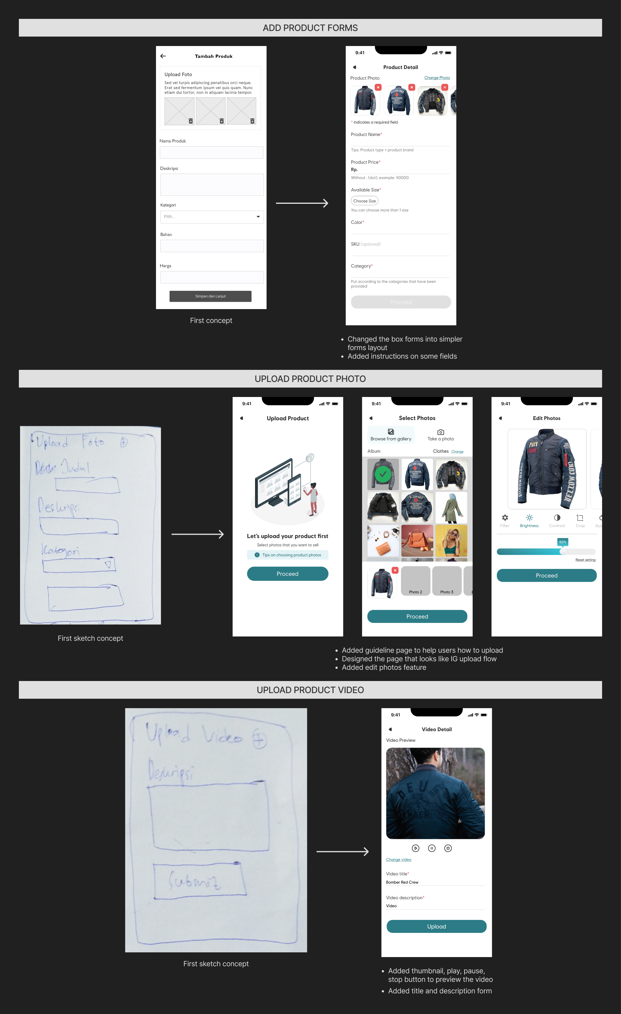
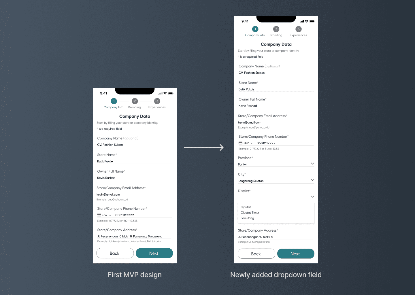
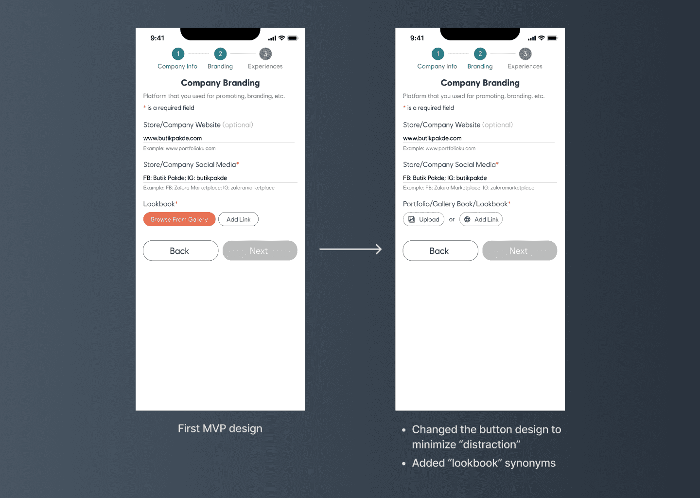
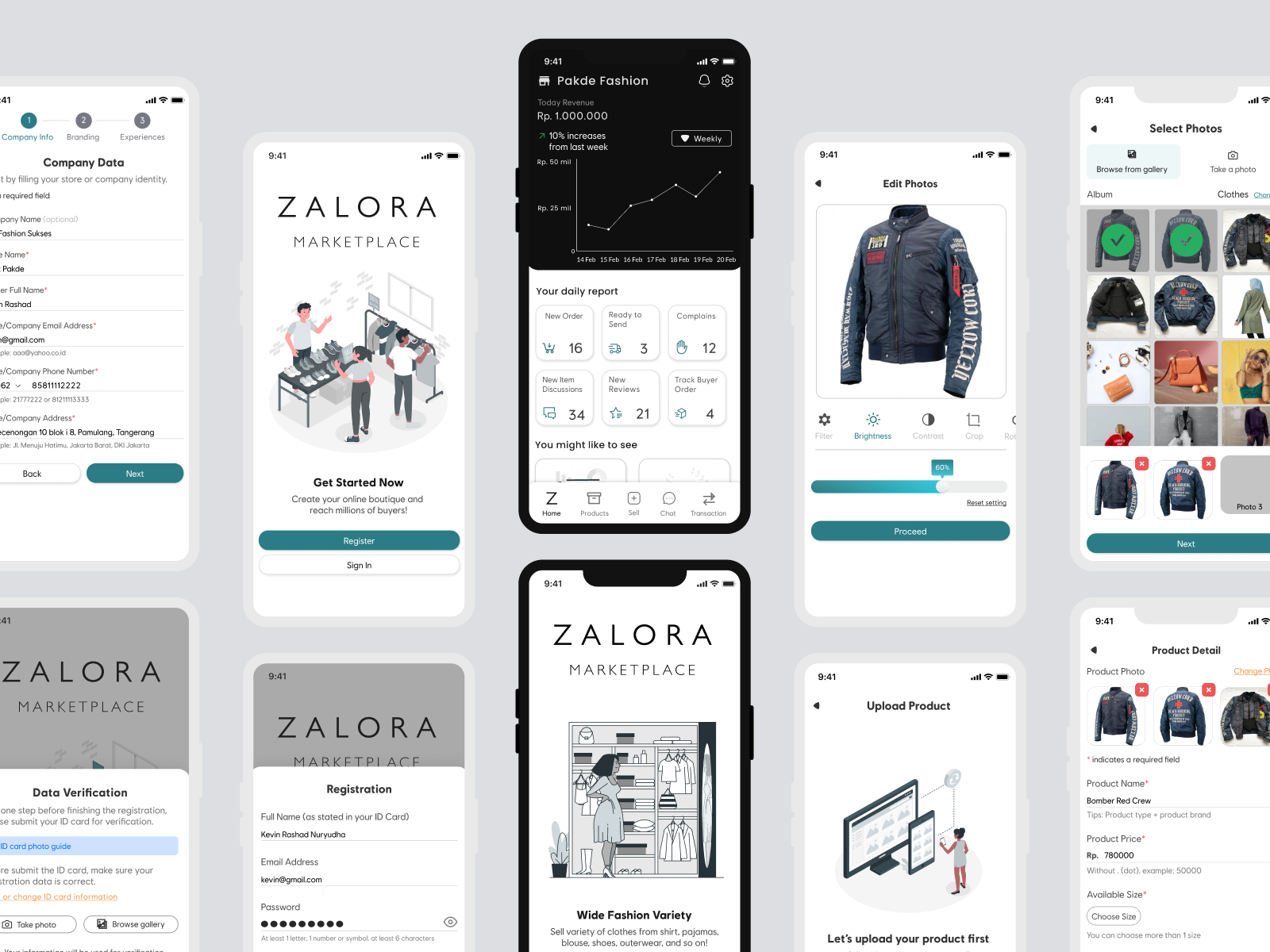
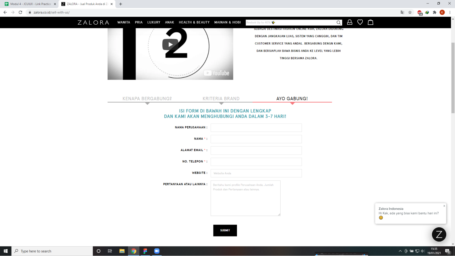
  • Designing a streamlined account and store registration experience that minimizes seller's frustration and time spent on the process.
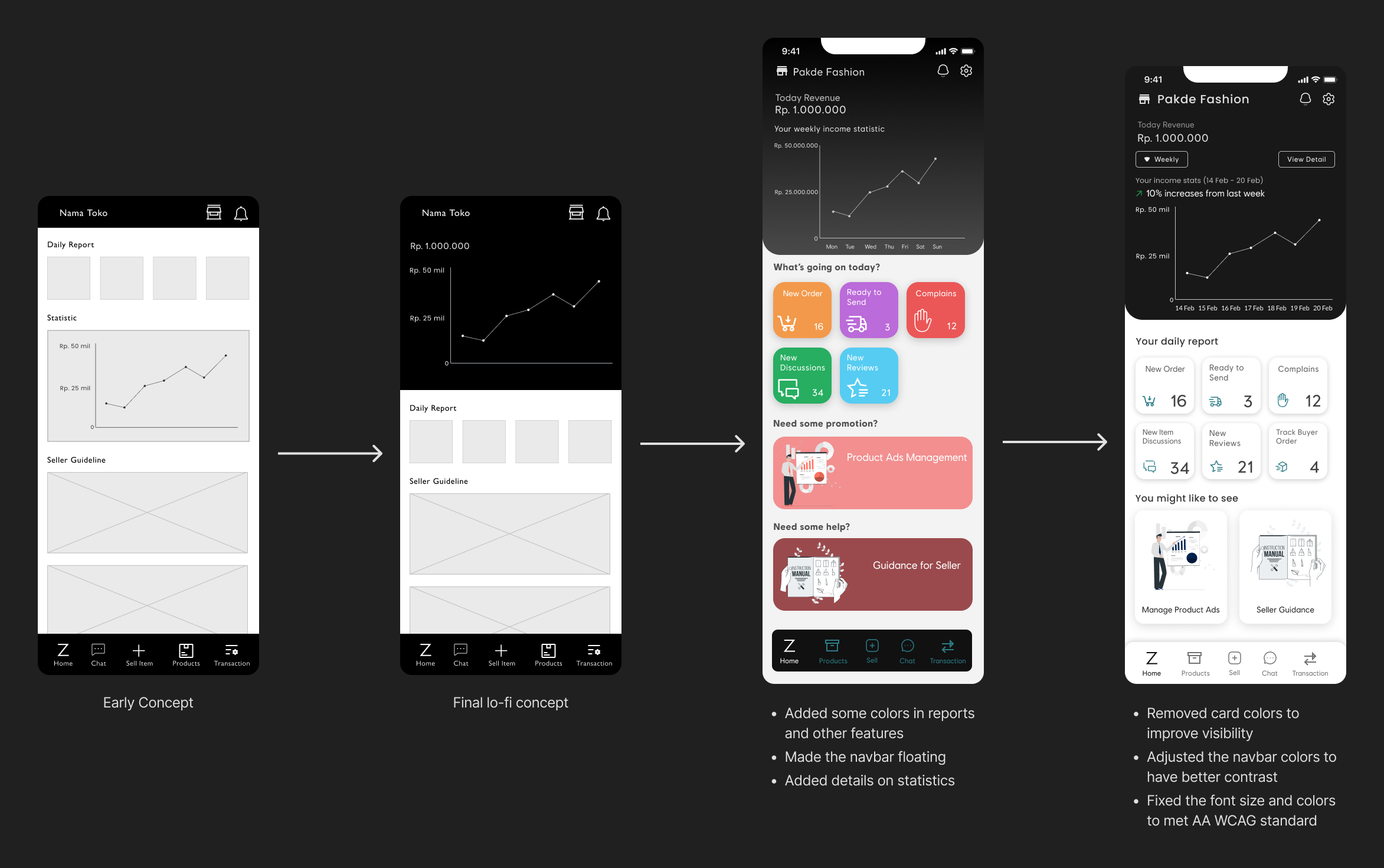
  • Developing a product uploading feature that is intuitive and simple to use, reducing user error and frustration when adding products to their store.

Research & define

Identifying Opportunities for Improvement

Currently, the registration process is manual and requires applicants to fill out a web form. Additionally, there is no mobile app available for sellers, which may cause delays in the registration process. Furthermore, the provided forms may be confusing to users and do not allow for direct document uploads, leading to further delays.

Emphatizing the Seller’s Needs and Problems

To ensure a thorough design process, I conducted interviews with five experienced online fashion sellers who have been in the industry for at least a year. By doing so, I was able to gain valuable insights and better envision the solutions to be implemented.

Below is the questions that I had asked.

Mapping the Interview Results

I interviewed three UKM sellers in the online fashion business with min. one year of experience. The critical point was they wanted to sell at Zalora with minimum registration rules. They also expected a user-friendly way of launching and editing product photos.

Comparing with Similar Applications

As part of our research process, we evaluated other well-known e-commerce platforms to identify areas where we could enhance our solutions.

Arranging the Challenges and Possibilities

exploring ideas

Generating User Journey

After developing the "How Might We" questions, I envisioned the user's experience within the application by creating a user journey. This helped me to develop clear and actionable solutions for the identified problems.

Sitemapping

As I began the design process for the Zalora Indonesia seller mobile app, I knew that creating an intuitive sitemap was important for the success of the project. Drawing from my experience in designing for popular e-commerce apps and my research, I carefully crafted a sitemap that would not only be easy to navigate but would also meet the specific needs and preferences of the Indonesian fashion sellers.

Exploring Design Solution

I created several designs to find the right user-friendliness feel for possible solutions. In this phase, I looked at design inspirations from top marketplace applications in Indonesia to get an intuitive feel. Some of the explorations I put here came from sketches or lo-fi mockup ideas that drew during the class session.
Onboarding
I explored which design has an excellent minimalistic layout on the onboarding page. I preferred the page design on the right because it is minimalistic and doesn't give the user a rush feeling. In other words, they can understand the onboarding feature better.
Registering and verifying the user account
I had to create several homepage designs to find the right user-friendliness feel. Based on my mentor's recommendation, I put the privacy policy terms on the overlay to ensure the clarity of user's private information.
Dashboard or Homepage
Since this is my first time designing a dashboard mobile app, It took me a while to explore the design inspiration. Finally, I discovered the final design by looking at various mobile dashboard exploration designs with good patterns.
Adding the product
Since most participants prefer Tokopedia Seller app, I looked at the app design to know how adding new products works. By knowing that, I got more inspiration to solve the existing app's pain points which was a time-saver for me.

prototyping the mvp

Registering New Account

I designed these registration pages by following the typical pattern of similar applications, so new users can quickly go through the process. Preferably, users must verify their ID to avoid scamming, fake accounts, etc., with ID card photos and OTP code.

Creating New Shop

Users could register directly by tapping the Yes button and then be redirected to a shop registration form page. They can fill in their shop identity, brand information, and sales experience, which I provided loosely based on Zalora Indonesia registration terms. I created which form is required and optional to be filled.

As you can see, feedback will inform users about the following status in the end, so they can rest assured knowing what the next step is.

Adding New Product (Photo Editor)

We can add a new product by tapping the "Add" button on the navbar. Then, the users see the upload guideline, and after that, they will select the items to be uploaded. Finally, they can adjust the item photos' size and quality as they want!

Adding New Product (Upload Product Video Feature)

After editing the photo, users will fill in the product specification and description form. After that, users can browse and adjust the video detail and quality if they want to showcase their product through video. They also can fill in the video title and description accordingly. Finally, users will submit the item.

uSABILITY Testing

In this section, I asked 5 online sellers' colleagues to test the prototype to find the flaws and get insights for improvement on the next iteration. I conducted the testing with participants through Zoom, and they used Maze to interact with the missions I gave.

updating design for second iteration

Adding province, city, districts, and sub-districts in registration
I learned from the participants that filling the full address with province, city, district, and sub-districts on one field could be bothersome. Therefore, I created a separate field to input province, city, district, and sub-district where they can quickly filled with autocomplete feature.
Adjusting “Lookbook” input field
During testing, the heatmap result showed that participants wrongly tapped the button to input the look book link. It happened because they tended to focus on the highlighted button (upload button) that slowed down completing the goal. So, I removed the button color and changed it with the icon, hoping users could differentiate better next time.

In addition, Some participants were confused with the term “Lookbook” because it’s a rare word in the fashion world. So, I decided to add few phrases for better understanding.
Lessons Learned

See other projects

Monitoring EkspansiComby